It’s All Relative: Why Benefits Benchmarking is Important
 This content is subject to copyright.

National health survey results are great for identifying benefit trends and getting the big picture. But if you’re a benefits manager, you need data that’s more than interesting – you need data that’s actionable. That’s where benchmarking comes in. Benchmark data can tell you how your program stacks up against organizations of your size, in your industry, and in your geographic region. There’s a lot of variation in those categories that’s hidden in national results.
Let’s start with industry. For at least the past decade, we’ve noted the increasing national enrollment in consumer-directed health plans (CDHPs), but some industries account for a larger percentage of this increase than others. Enrollment in HSA-eligible CDHPs is highest in financial services, at 43% of all covered employees, but when you look at the health care industry, the enrollment rate is less than half that, at 21%. The financial services industry has a higher average salary than other industries, so employees have more to gain from the tax-advantaged status of their health savings accounts. If a financial services employer wants to know whether their HSA plan enrollment is leading or lagging, the number to beat is 43%, not the national average of 29% for all employers with 500 or more employees.
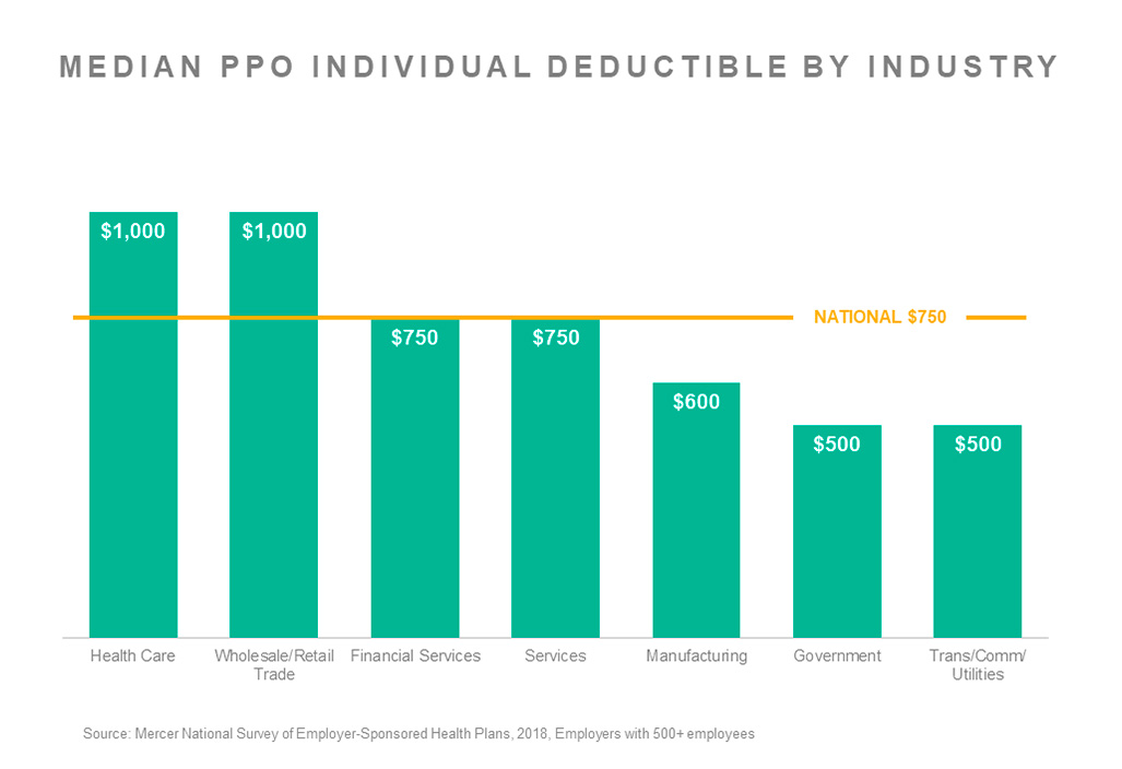
Plan design also varies based on industry. The median PPO in-network individual deductible is $750 nationally for employers with 500 or more employees. But that ranges from just $500 among government employers and those in transportation, communication, and utilities, to $1,000 at the other end of the spectrum, among wholesale/retail and health care employers.
Employer size also has a big impact on survey results. When examining cost increases for 2018, we see a lot of variation from one employer to the next. Some employers had flat cost, some had double-digit cost growth, but there are definite patterns based on employer size. The smallest employers (those with 10-499 employees) were the most likely to have had very high increases – 29% saw cost rise by more than 10% in 2018. Jumbo employers – those with 20,000 or more employees – were better able to keep their cost increases moderate; only 9% experienced cost growth of more than 10%. That’s important for employers of both size groups to keep in mind when assessing plan performance.
Taking a look at regional data, we find some interesting differences as well. We noted in a blog post back in 2015 that dental cost was far higher in the West than in other regions of the US, and that still holds true today. And voluntary benefits to supplement medical plans are more common in the South -- which means that employees in this region are more likely to expect their employers to offer them.
| South 500+ | West 500+ | Midwest 500+ | Northeast 500+ | |
|---|---|---|---|---|
| Accident | 71% | 65% | 60% | 56% |
| Cancer / critical illness | 68% | 56% | 57% | 49% |
| Whole / universal life | 43% | 33% | 37% | 35% |
| Hospital indemnity | 32% | 30% | 24% | 18% |
Of course, the point of knowing how you stack up is to help you meet business and human resource objectives. Is your goal to make sure your benefits are in line with the typical programs in your market to ensure you have a competitive, but not overly rich, offering? Or does your organization want to be seen as an innovator or ‘leading the pack’ in certain areas, and outpace the benchmark? You may want to benchmark your program not just against your industry, but against a segment of your industry. For example, in the wholesale/retail trade industry, the median employee contribution for individual coverage in an HSA-eligible CDHP is $79 a month. But if your goal is to keep employee contributions low to offer a more competitive benefit package, you could look at the industry data in quartiles. At the 25th percentile, the employee contribution is $48 – and maybe that becomes your starting place. But without a clear objective, even the best benchmark data won’t be actionable – although it might still be interesting.
Mercer’s 2018 National Survey of Employer-Sponsored Health Plans final report and data tables are now available. You can also visit our website to check out a few graphs or download an executive summary for free.